
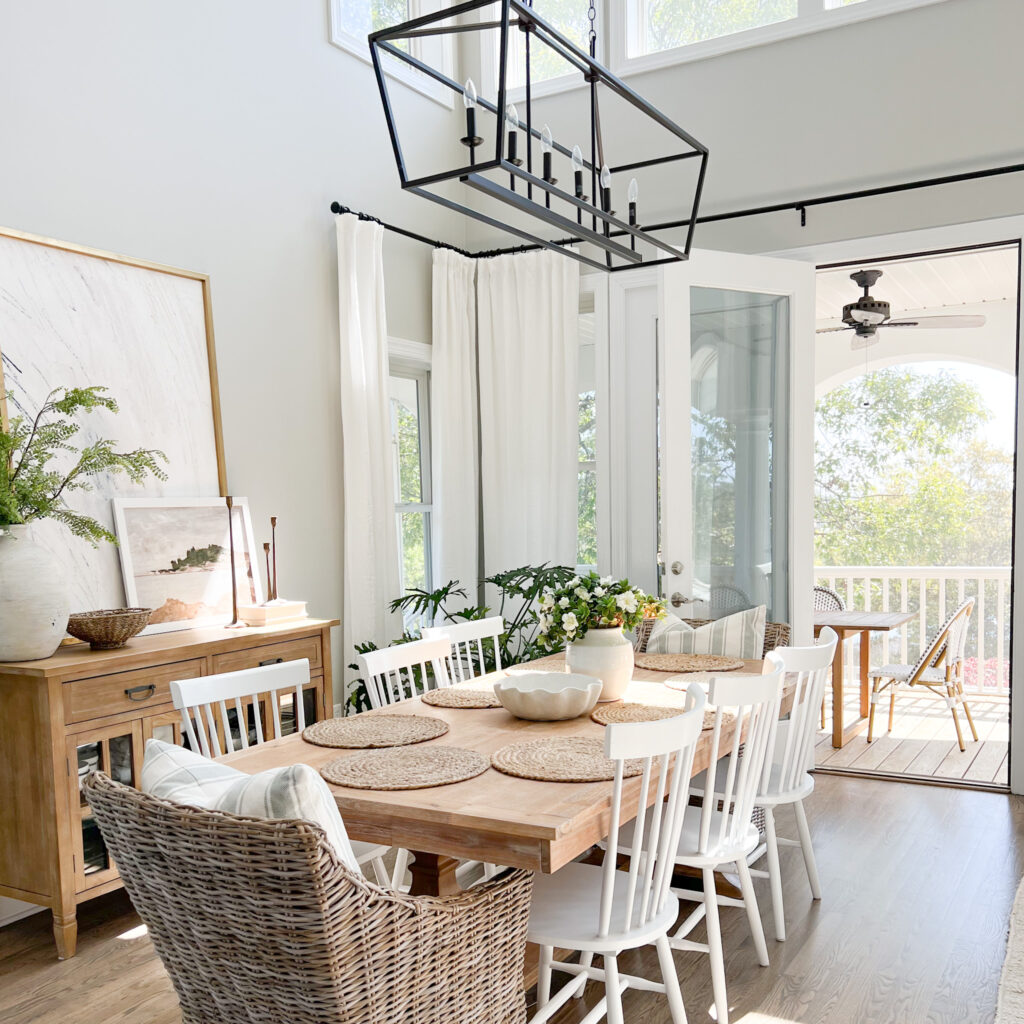
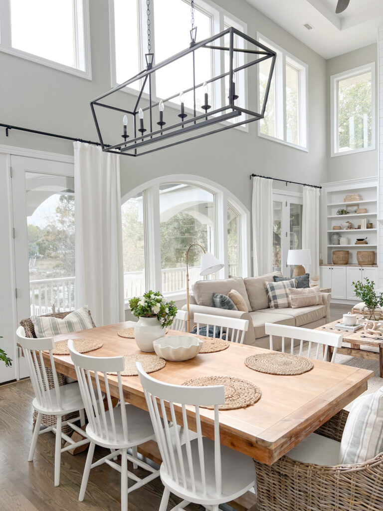
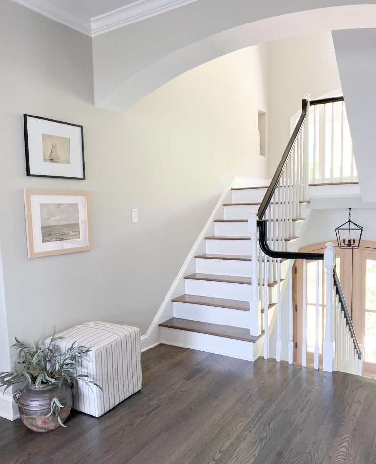
Color Spotlight: Repose Gray SW 7015
Recently, I shared a color spotlight on a pure gray color that I’ve fallen in love with – but my love for gray paints doesn’t stop there. Repose Gray is a warm neutral gray that I believe to be an amazing option for your home, and here’s why!
What makes a good wall color?
It can be hard to decide what paint color you love the most when it comes to a room that you’ll be looking at for years to come. You’ll want to choose a color that complements other rooms and decor to create cohesiveness in your home. You’ll also need to decide if you want a neutral or more bold look.
Next, you’ll need to consider the things in your home that are more costly to change. Your wall color can always be painted a new color, but things like your flooring, trim, and other fixed finishes will more likely be a more permanent staple in your home. A good gray can go a long way, especially one like Repose Gray.
Is Gray going out of style?
In short, you may not see as much gray in high-end design currently, but you will always see neutral colors. Choosing a good neutral gray without too many undertones is important for a timeless look. As a designer, I’m still seeing a ton of gray within new builds. Grays and beiges will always bounce back and forth and it is best to go with which one you prefer.
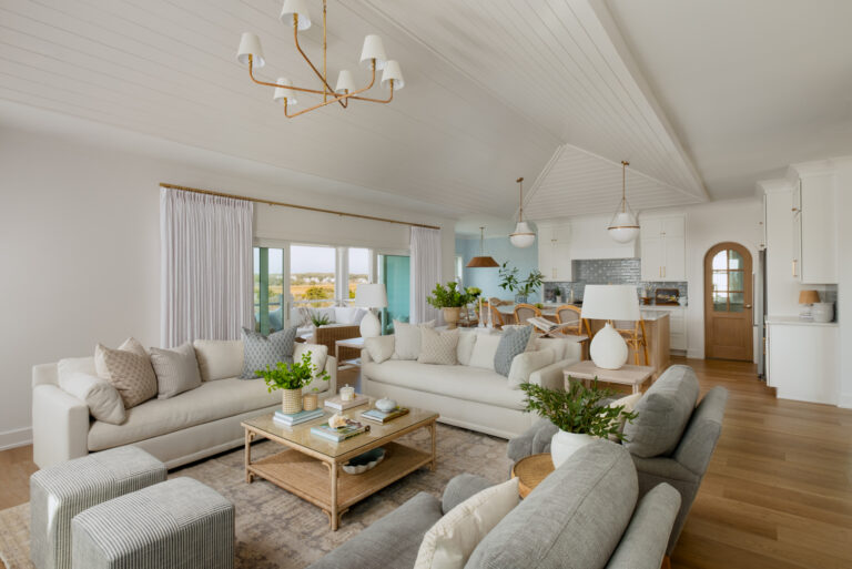
Repose Gray is Warm Neutral
The thing I love more about Repose Gray is that it is a warm neutral. It has green and taupe undertones, so it leans warmer and doesn’t feel cold at all. It is slightly less warm than Agreeable Gray (also by Sherwin Williams) and is a touch darker.
As with all paints, it’s important to test it in a small area in your space so you can see it at different times of the day. Lighting can always alter the color and make it seem cooler than it actually is. Generally, Repose Gray stays a warmer color.
Repose Gray vs. Other Gray Wall Colors:
When you look at Repose Gray with other colors, you can see how it differs. Here’s how it compares to some other warm (and cool) grays:
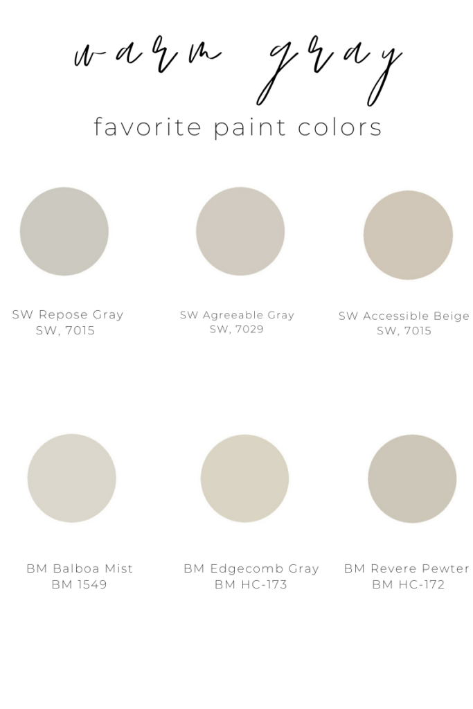
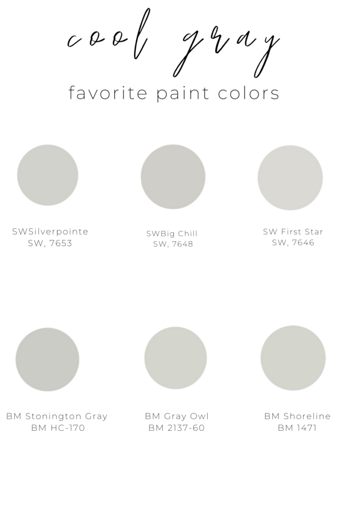
You can see just how much warmer Repose looks against the cooler grays. It truly is a warm without being too beige. This is my favorite part of this color!
All-in-all, if I had to pick wall color again, I would pick Repose Gray 100 times! It’s a great gray for a modern coastal home.
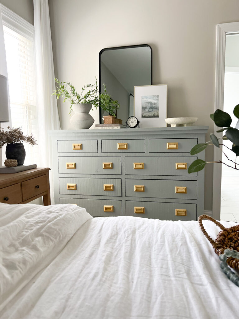
What color is the dresser in this post? Thanks in advance! It’s beautiful!
Thank you!It is BM Boothbay Gray. Such a gorgeous color!!